Objective: I was instructed to research a dead or dying brand and relaunch it with a different visual identity. In the rebrand, we were to take the current brand mission and update it, while still staying true to the brand’s soul.
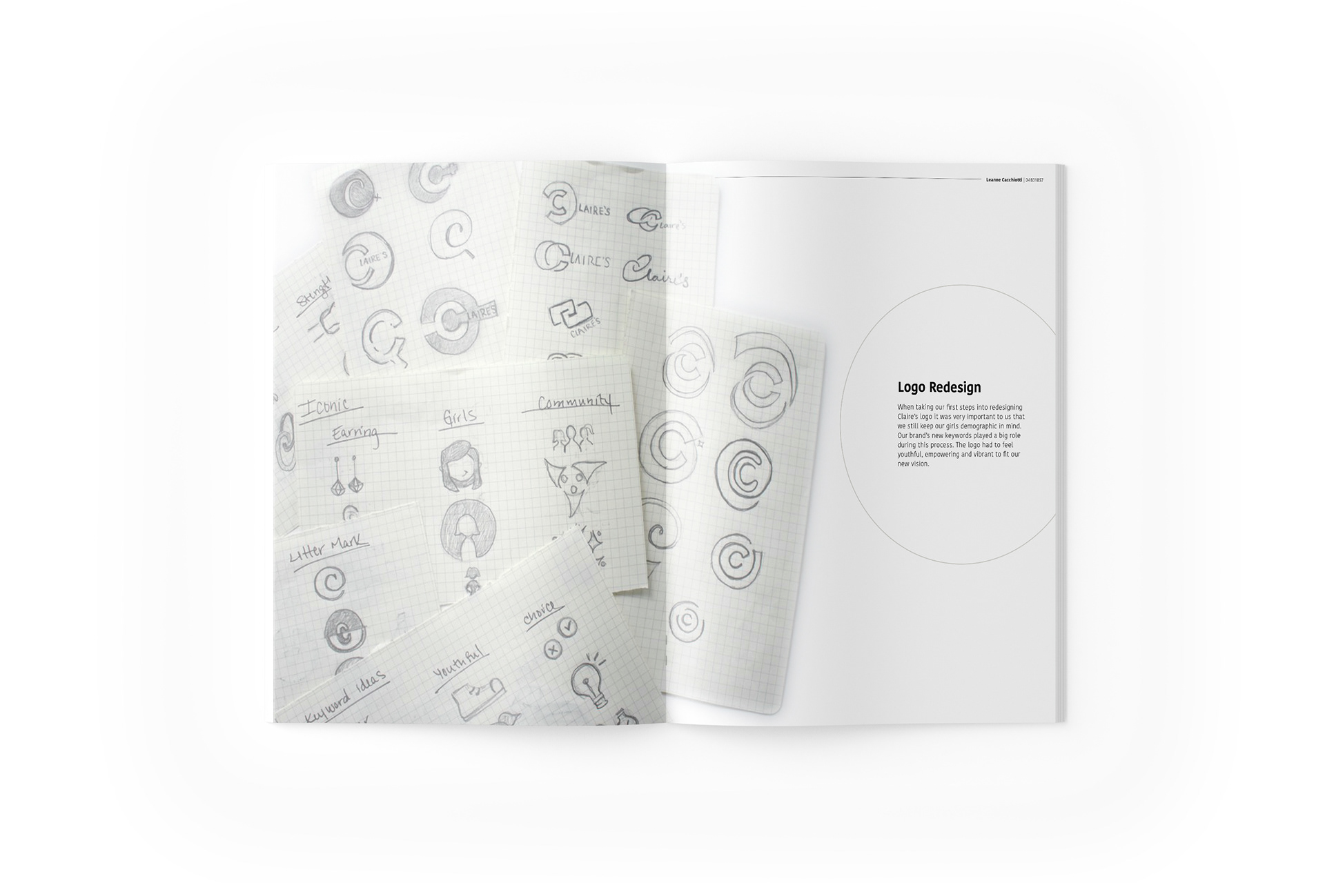
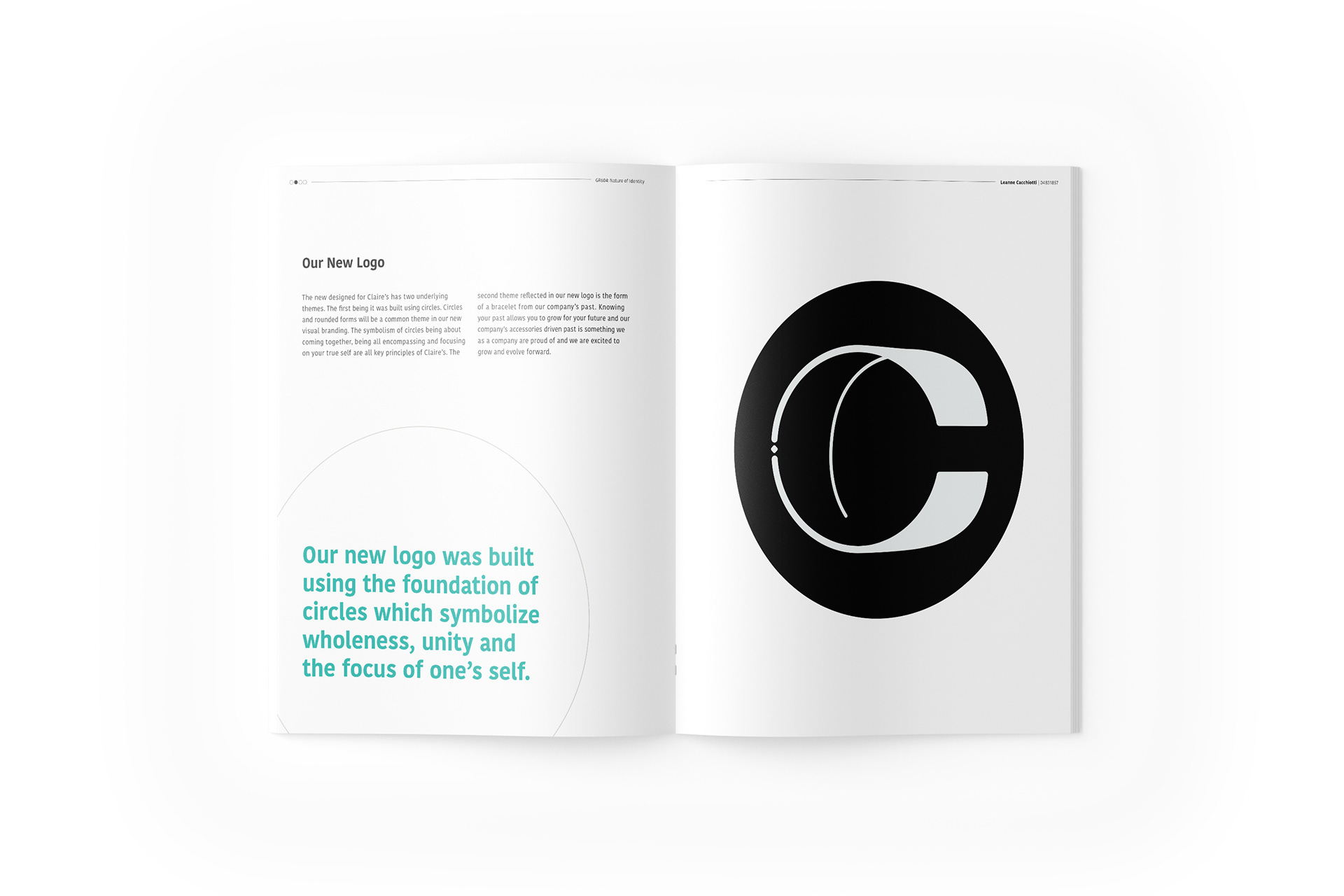
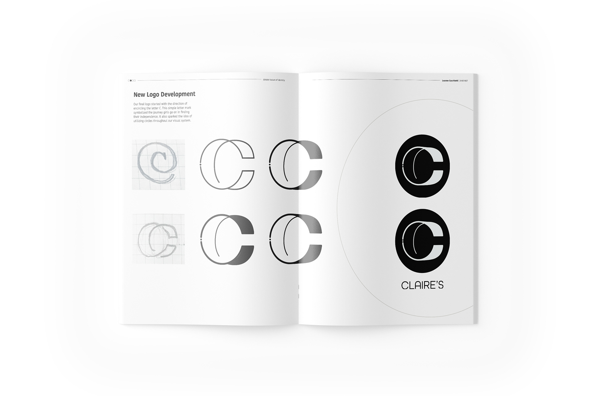
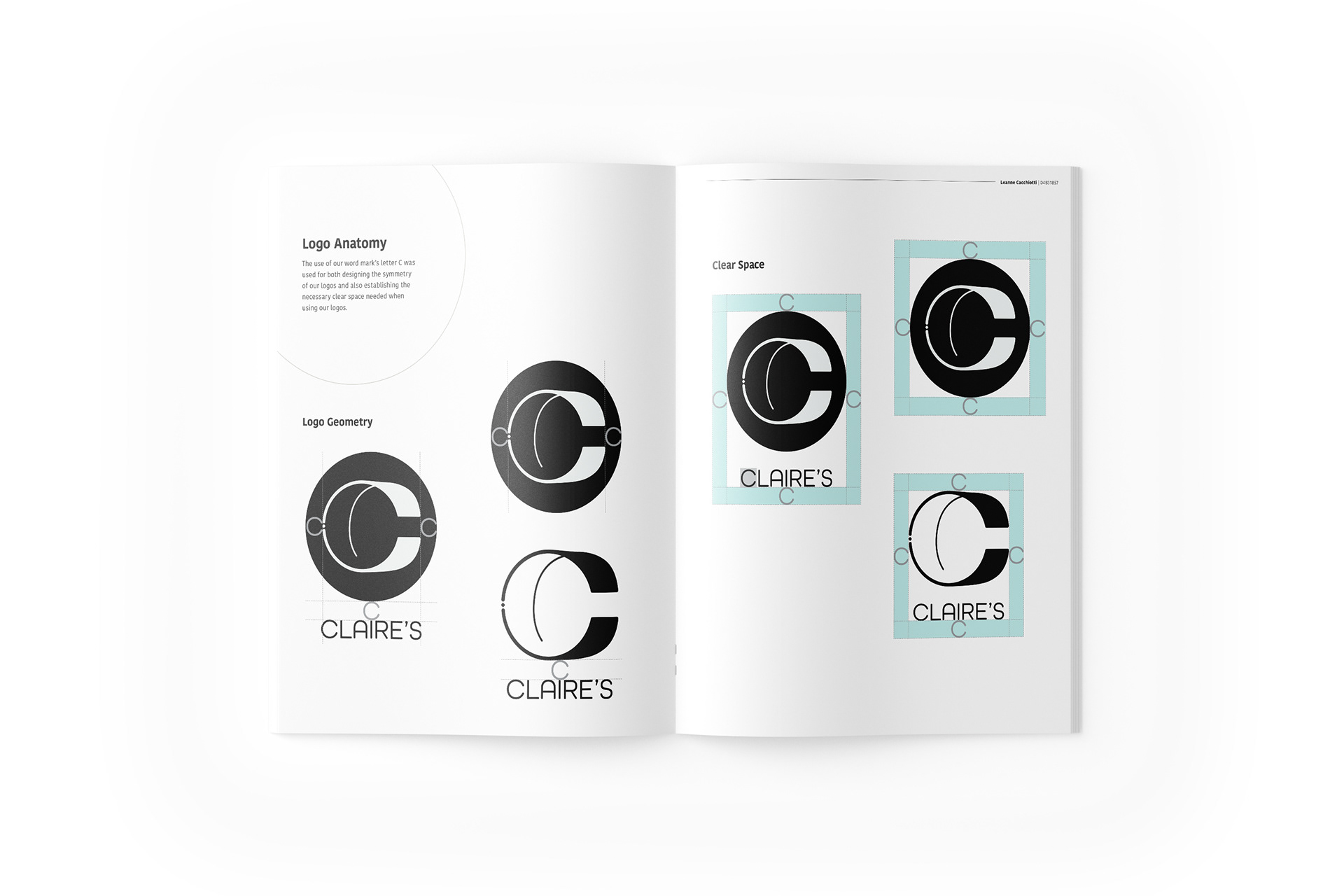
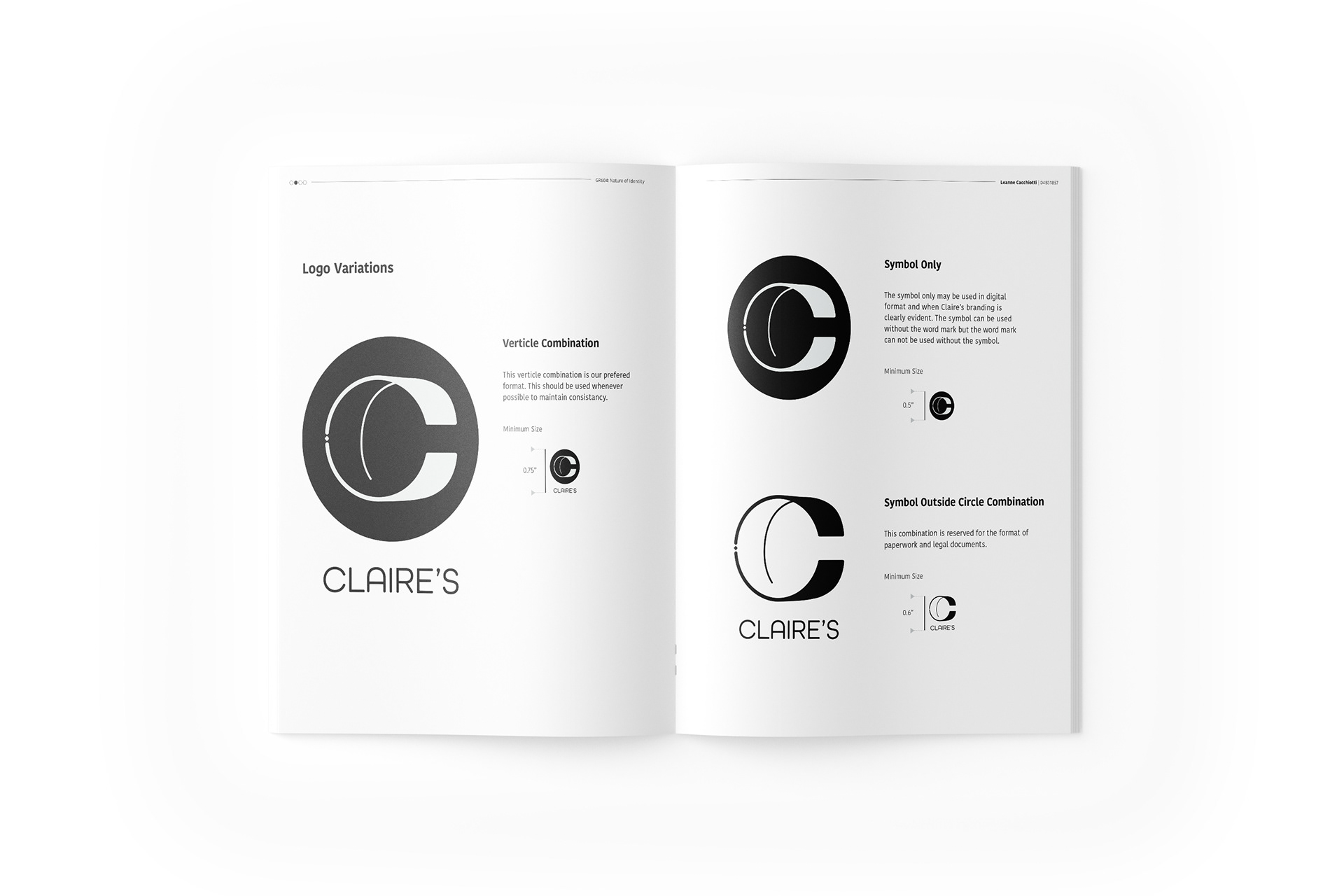
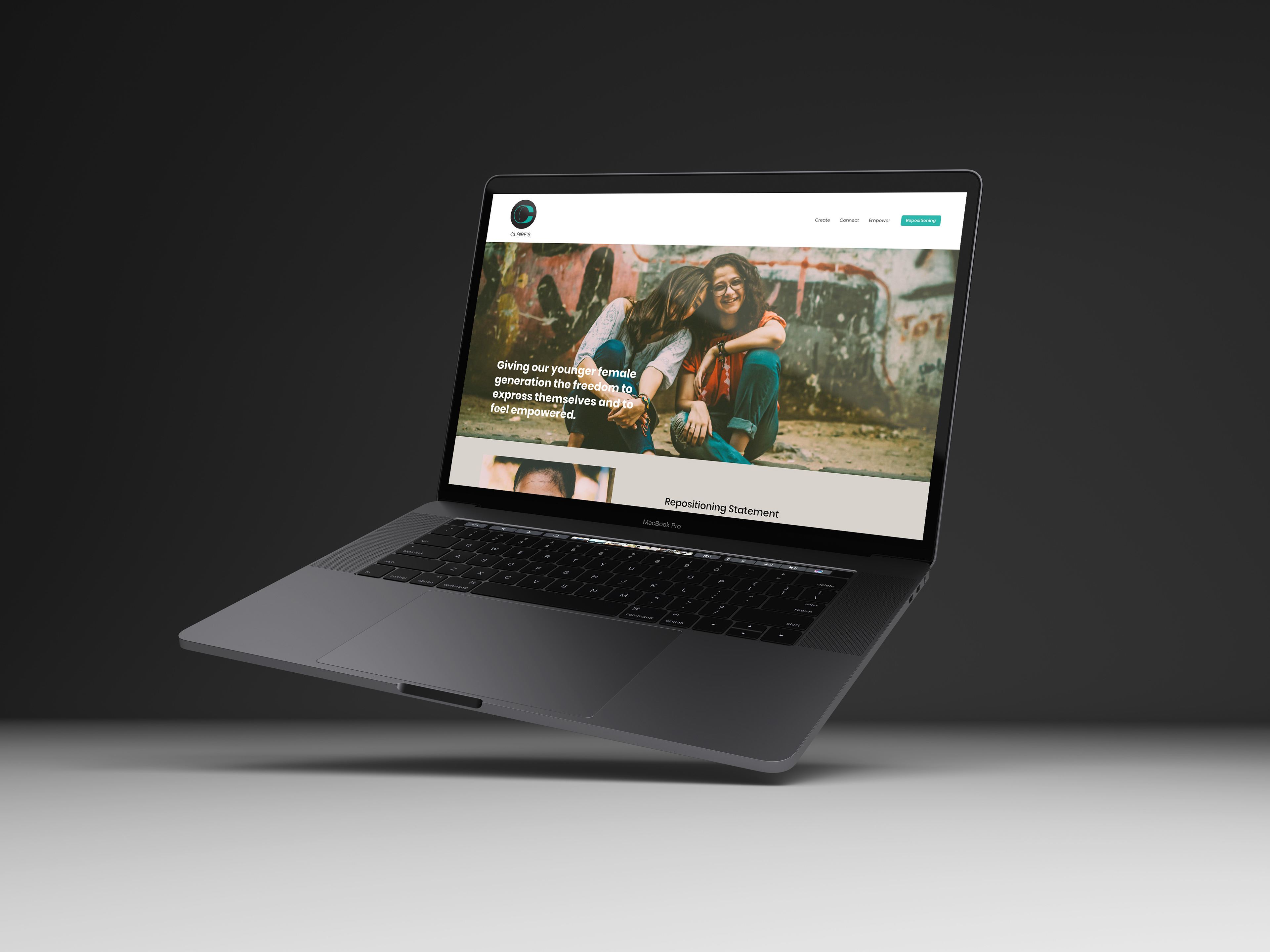
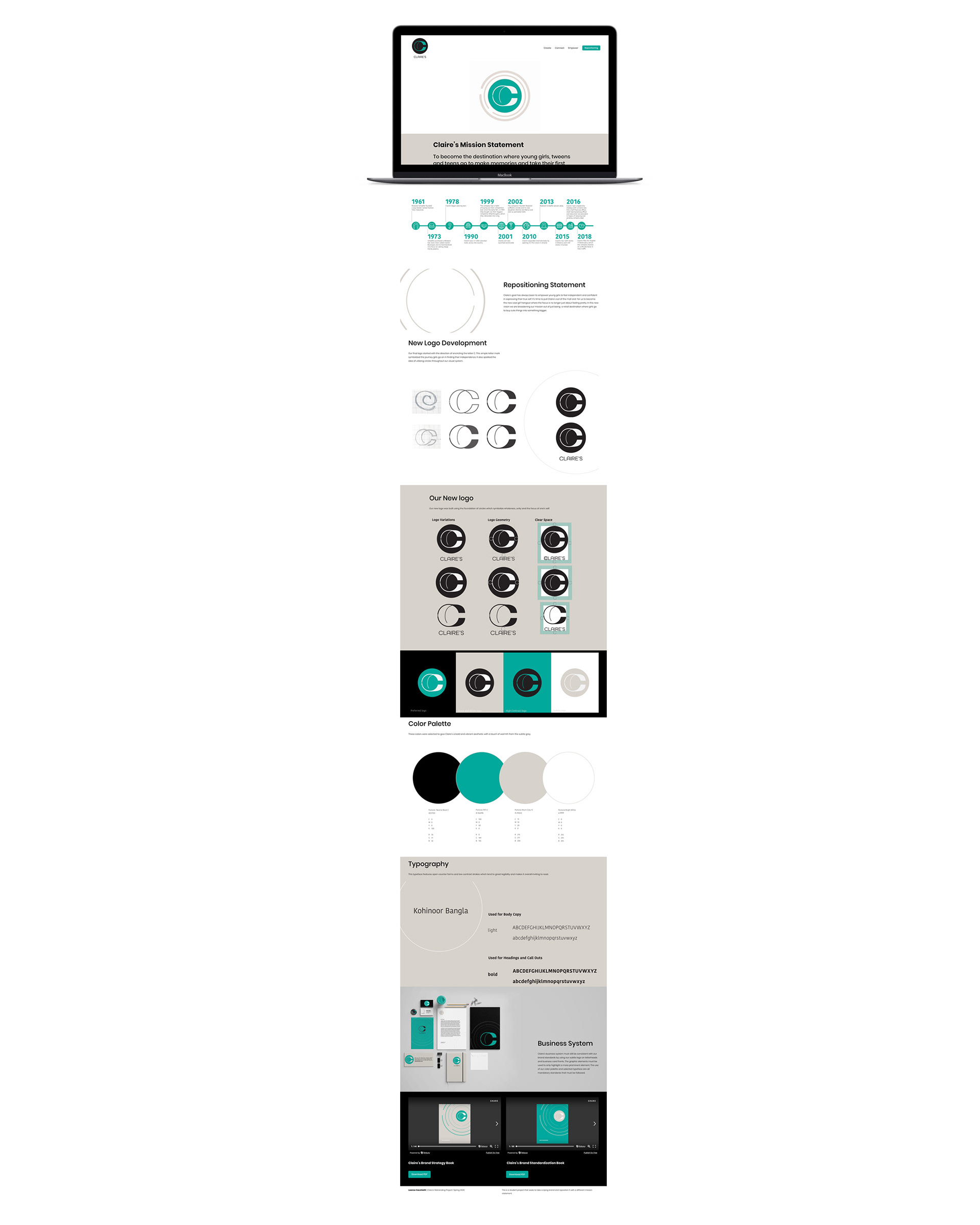
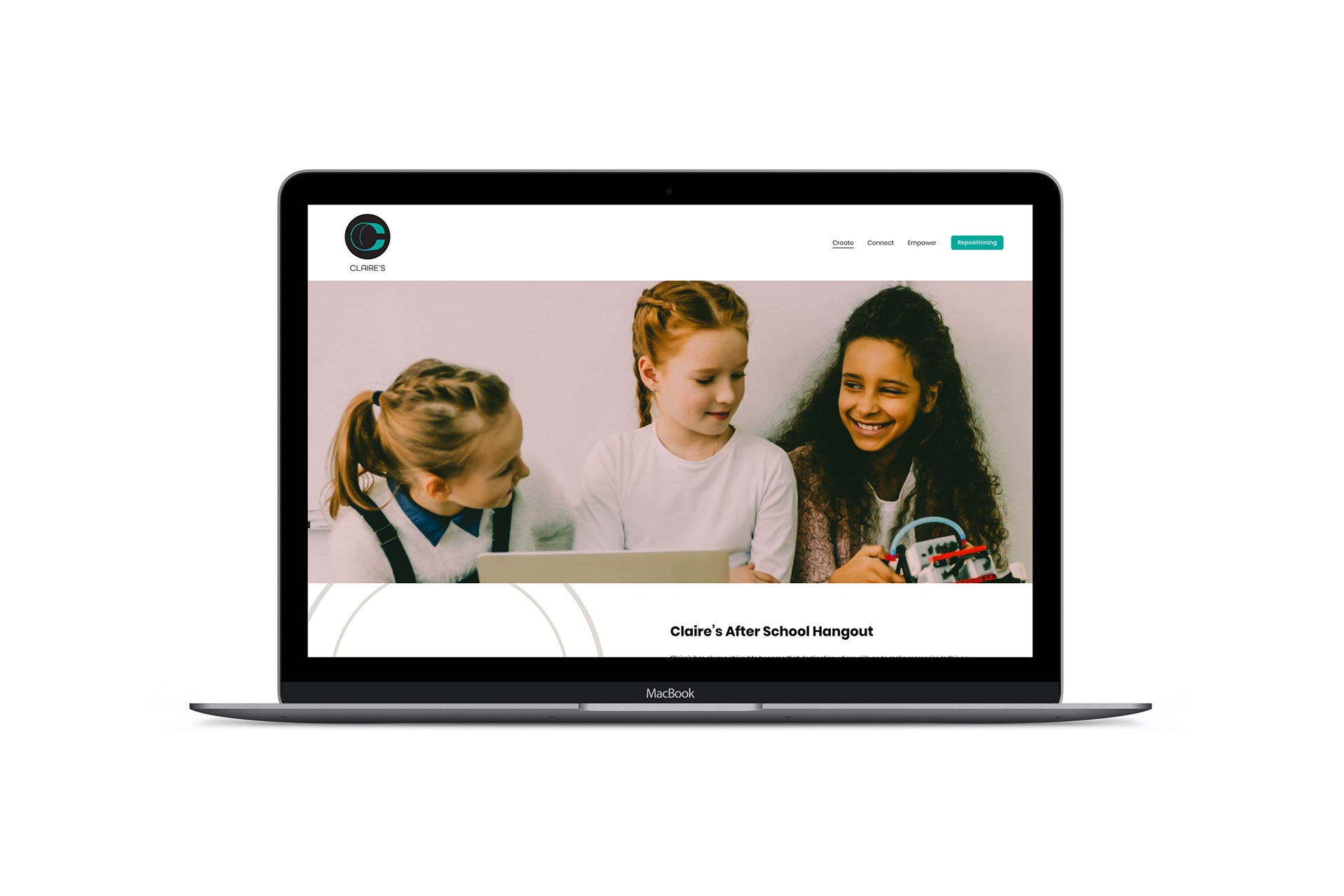
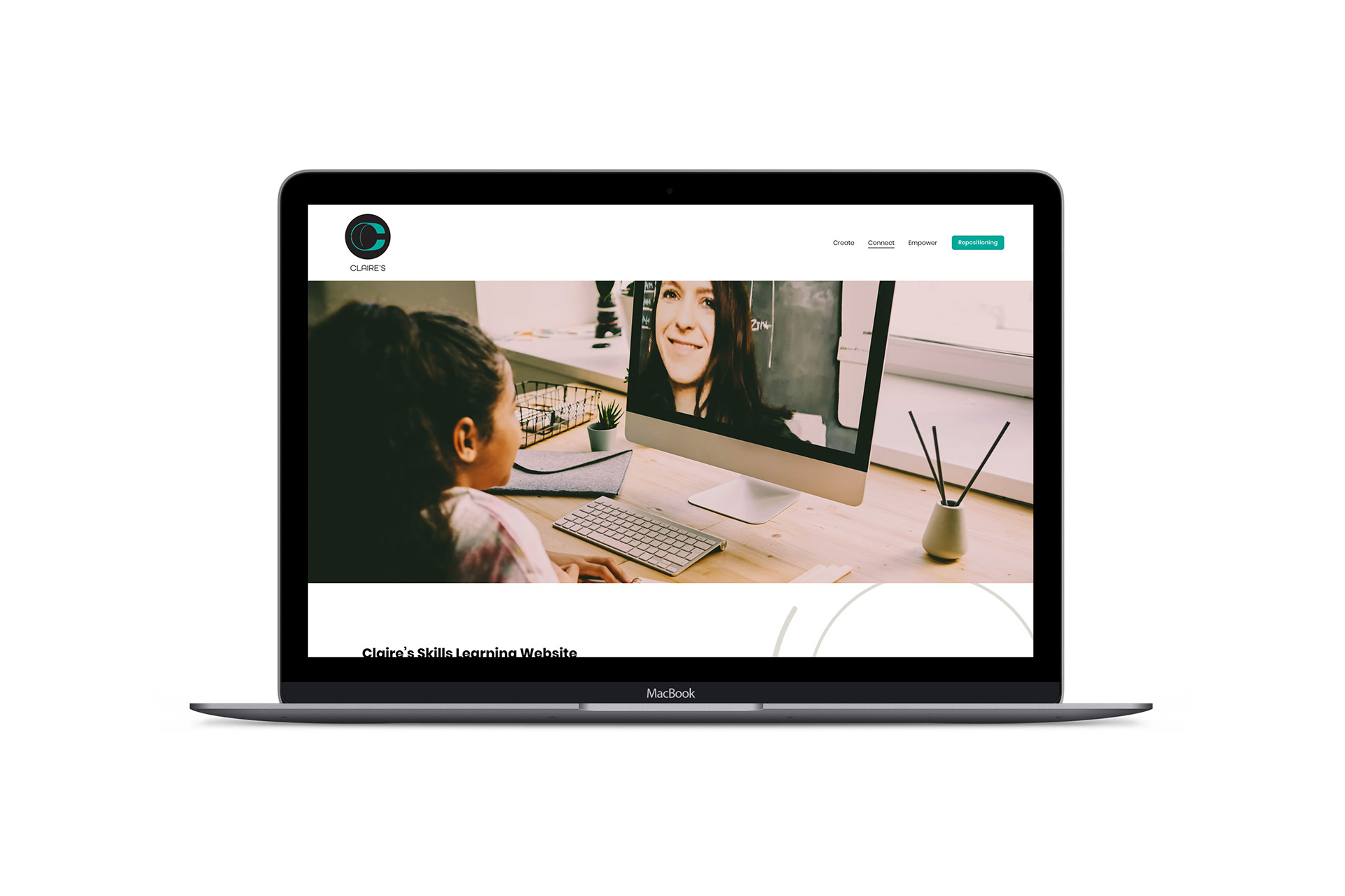
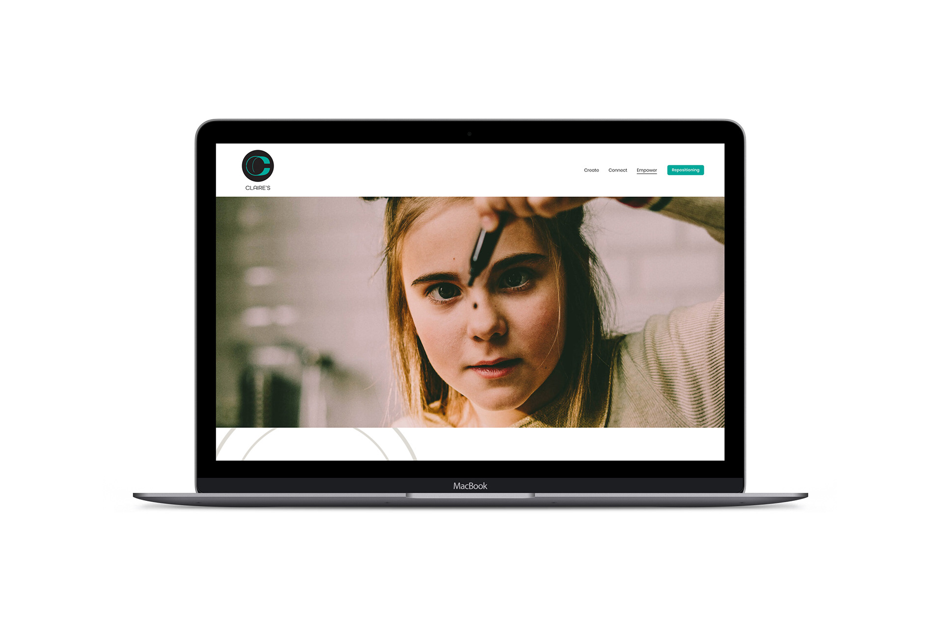
Approach: The company I chose to relaunch was Claire’s because it is a brand that is nostalgic to my childhood. In designing a new Brand Strategy Book and Brand Standards Book, I was able to update both the visual system of Claire’s as well as its mission statement. It was important for me to keep the idea that Claire’s is a business that empowers our young female generation to be independent and at the same time to modernize it to avoid too much emphasis on outward appearances. I created a more modern color palette of black, white, and turquoise with a balancing color of a warm grey to help simplify the brand’s visual system. The new logo I created was centered around the idea of using circular forms to symbolize coming together; all- encompassing and focusing on one’s self. All my designs and brand extensions centered around the ideas of creating, connecting and empowering Claire’s clientele.
Year of Completion: 2020
Disciplines: Branding, UX/UI Design, Logo Design
Kind of Project: Brand Identity, Print Design,
Digital Design
Digital Design